
Thursday, October 22, 2015
Propaganda Poster

Friday, October 16, 2015
Chapter 7 Part 2

As a new DTC student who graduated from WSU with business, critiques was rarely used at all during my time as a student. Critiques now a very common and almost weekly. Stewart makes a bulleted list of questions that the reader can ask that can help them be a better critiques. I think I am personally pretty bad at critiquing so the bulleted list helps. One of the key questions are “Is the visual information tightly packed creating a very dense design, or is the design more spacious, with a lot of space between shapes or volumes?” (142). Another question that I found interesting is “What is the size of the project?”. That question may not apply to all cases when looking at certain art pieces due to the limits usually placed when first making the art project but with more of a hands on, physical piece, like sculptures, people will ask why you chose to pick the size that you went with.
Chapter 7 Part 1

In Chapter 7 of Launching the Imagination by Mary Stewart, she talks about developing critical thinking. I believe on all syllabuses that are handed out at WSU, under university learning goals, the first thing that it listed is “critical and creative thinking”. Stewart says the “establishing criteria” is the first step (140). Stewart lists out questions that makes the student think what teachers try to do. One of the questions listed are “What is the purpose of the assignment?” which can be answered in many different ways. To me, the purpose of any assignment is to apply skills that I know or will learn in order to complete the assignment.
Chapter 6 Part 2

In Chapter 6, Stewart also talks about characteristics of good goals. Ambitious yet achievable is one of the characteristics listed. Stewart says “Too modest a goal will provide no sense of accomplishment. Too ambitious a goal will reduce, rather than increase, motivation.” (131). I gave up soda for my 2015 New Year's resolution. Was my resolution too modest? No, it was not. Now is it too ambitious? I would say no as well since cutting out soda is one step of many to become a healthier me. A too ambitious of a goal, no matter how much I truly would want, is cutting all sweets from my life. I love chocolate too much to actually do that for a whole year but realistically I can maybe cut all sweets from my life for a month at the most.
Chapter 6 Part 1

In Chapter 6 of Launching the Imagination by Mary Stewart, she talks about the seven characteristics of creative thinking. Conviction best describes who I am as a person. Quoting from Stewart, “Creative people value existing knowledge. Since new ideas are often derived from old ideas, it is foolish to ignore or dismiss the past.” (129). I like being open to ways to do things new or differently then what I am used to. I get to see if my way or the different way is more productive or not.
Chapter 5

In Chapter 5 of Launching The Imagination by Mary Stewart, she talks about problem seeking and problem solving. It has been bestowed on our young minds by the great minds of our previous generation that a good way to start pretty much anything is brainstorming. Stewart defines brainstorming as “a great way to expend ideas, see connections, and explore implications” (121). She also listed some of the common strategies like, make a list, use a thesaurus, explore connections, and keep a journal. Making a list is most likely the most common way to brainstorm so it is no surprise that it is listed first. I personally make lists all the time for various reasons. It allows the user to neatly organize a thought and connect that thought with other thoughts that he or she may think of later when deciding what they want to do with their art project or various other things. I think the most interesting brainstorming technique would have to be using a thesaurus. The book uses resentment and anger as an example and lists its synonyms. One of the synonyms is storm which an artist can use for their piece. Right now, I am trying to use depression to show a dark value in a art project. One of the synonyms for depression is sorrow which most likely best describes my art project. The other interesting brainstorming technique is keeping a journal. Journaling is a much harder concept for me to grasp as I am a virtual learner when it comes to all this art but I can see it work with others.
Chapter 4
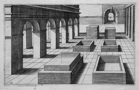
In Chapter 4 of Launching the Imagination by Mary Stewart, she talks about the illusion of space and the illusion of motion. In creating the illusion of space, Stewart mentions linear perspective. Linear perspective is a mathematical system for projecting the apparent dimensions of a three-dimensional object onto a flat surface (92). There is five basic concepts about linear perspective. The first concept, which is one I am used to the most is "objects appear to diminish in size as they recede into the distance". Jan Vredeman de Vries, Perspective Study shows this open area, and using a top-right motion to decrease the area behind the open area. By making the background small and in the corner, it makes the eyes of the looker to want to look beyond that area.
Photomontage Timelapse Project

Due to image quality/blogger being weird, I couldn't upload image within the first week the project was done. Sorry for being so late :P
For my Photomontage Timelapse Project I decided to use my house. It is my home, with probability some of the greatest memories with my life so that is why I chose it. Within a course of time, I took pictures of my house capturing it during different parts of a day within a week. The four main pictures I used was a cloudy morning, a bright morning, a evening, and at night. I chose the bright morning picture as my background as it just looked beautiful. With the other three themed pictures I cropped parts of those and added it to the original background in sections.
Monday, October 12, 2015
What's Trending?! 3
In today's What Trending?!, I wanted to talk about physical and digital video games. When deciding a video game nowadays, you can either do one of two things. You can either go out to your local Gamestop/store and buy the video game physically on a disc or you can buy it digitally with that fancy console you have. Personally, I think Microsoft and Sony are pushing towards a more of a digital download age, offering in-store discounts or forcing you to install the game in the console's hard drive. The CEO of Gamestop thinks that physical discs will always be a thing, and people will always want to trade-in their games for other games which is a valid point but from a developer standpoint, who has to buy blank discs in bulk, can save lot of money by just offering the game digitally. Times are changing and I believe discs will soon fade out.
Thursday, October 8, 2015
Vector Exercise Abstract Triptych

Here is my Vector Exercise - Abstract Triptych. It is very hard to tell. but I used my initials to make this. For the J and the V (the first two) I basically played around with anchor points on the letters and adding some of my own to shape it. Both are very random but I liked how they turned out. For my last initial, N. I simply moved the edge of the anchor points outwards. Rachel showed me some cool animal patterns in illustrator so I decided to use them. Animals are cool right? Finally I added random border strokes to each piece giving it a more abstract feel. I really like how the N turned out.
Subscribe to:
Posts (Atom)